Recently I was tasked to create a mobile site at work that behaved and had the feel of a native mobile application. The application itself is relatively simple with only three views. One of these views however needed a tab control on the bottom of the page, similar to an iOS navigation bar.
Immediately I thought the jQuery mobile navbar would provide the look and feel I was looking for. I figured that I could just have multiple data-role="page" elements and use jQuery mobile’s page switching mechanism to handle the transitions.
The Problem
This solution worked great, except that jQuery mobile doesn’t allow for global headers or footers. Each page has to have it’s own data-role="header" and data-role="footer" elements.
This lead me to create the following solution that allowed me to use tab control within a page, or within a fixed footer for a native feel.
The Solution
The solution I came up with was to create a bit of javascript and css that if I structured my markup automatically handles navigation tab behaviour without having to invoke it in a mobileinit or similar event. All you have to do is correctly structure your markup.
The Javascript
I created a short javascript file called jqm.navtabs.js that I can include whenever I want to enable navigation tabs. One caveat to this file is that it has to be included before the jQuery mobile script tag.
// include this file before your jquery-mobile script tag
$(document).delegate('.ui-navbar ul li > a', 'click', function() {
  //search the navbar to deactivate the active button
  $(this).closest('.ui-navbar').find('a').removeClass('ui-btn-active');

  //change the active tab
  $(this).addClass('ui-btn-active');

  //hide the siblings
  $('#' + $(this).attr('data-href')).show().siblings('.tab-content').hide();

  return false;
});
The CSS
I added the following css rules to my css overrides file that I’m using for custom css or overriding jquery mobile’s css.
/* jqm.navtab styles */
.tab-content {
    display:none;
}
.tab-content:first-child {
    display:block;
}
And finally the markup
<!-- the content markup -->
<div id="tab1" class="tab-content">
  Tab 1 Content
</div>
<div id="tab2" class="tab-content">
  Tab 2 Content
</div>
<div id="tab3" class="tab-content">
  Tab 3 Content
</div>

<!-- the navbar markup -->
<!-- place in a data-role="footer"  for a footer navbar -->
<div data-role="navbar">
  <ul>
    <li><a href="#" class="ui-btn-active" data-href="tab1">Details</a></li>
    <li><a href="#" data-href="tab2">Media</a></li>
    <li><a href="#" data-href="tab3">Map</a></li>
  </ul>
</div>
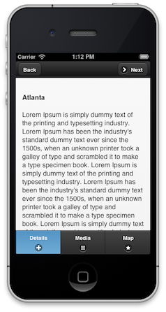
The End Result
The Gist for this code is located here.