Clipster compatibility updates

Today we worked on some compatibility upgrades. The currently released version of Clipster (0.5.3) requires Rails 3.2.8, this is a result of the version of rails development started on. Our goal is to support rails from Rails 3.0 on. As of right now the development branch of clipster has been upgraded to support all the way back to 3.1.0.

While you probably wouldn’t want to be running such old versions of Rails, we wanted to support as many as we could because we know sometimes upgrading isn’t in the cards. The oldest version of Rails we could potentially support is 3.0 due to the fact that Clipster itself is an engine.

As part of this upgrade we are also working to improve our continuous integration testing with travis-ci. As part of these improvements, after we certify that old versions of Rails are compatible we will hopefully have travis-ci test new improvements in the latest versions of 3.2, 3.1, and 3.0.

One thing of note as a result of this compatibility upgrade is that we discovered that Rails versions before 3.2 will potentially fail with just self.primary_key = :column_name in models. We didn’t want to change back to a deprecated method, so we added a conditional call to set_primary_key. We accomplished that by creating a ModelUtilities mixin so that we can reuse our version testing logic. You can view the code for that mixin here and the usage in a model here. While this may not be the most elegant way to fix that error, it works and gets or compatibility changes moving along.
Debugging Mobile Web Apps on OS X

While working on a mobile web application today that involves mapping, I ran into an issue that the map would load on a desktop browser but not the Safari browser within the iPhone Simulator app. After a bit of googling I learned that by enabling the Developer menu in Safari on OS X that it gives you the option to load up a remote debugger to the iPhone simulator’s instance of Safari.

To enable the developer menu and debug your web application in Safari on OS X follow this path.

  • Hit command + ,
  • Click Advanced
  • Check Show Develop menu in menu bar
  • Launch your web application in the iPhone Simulator
  • Click Develop > iPhone Simulator > <YourWebApp>

Hopefully this will help someone else who is trying to debug a remote application on a mobile device.

Creating a jQuery Mobile Tab Control

Recently I was tasked to create a mobile site at work that behaved and had the feel of a native mobile application. The application itself is relatively simple with only three views. One of these views however needed a tab control on the bottom of the page, similar to an iOS navigation bar.

Immediately I thought the jQuery mobile navbar would provide the look and feel I was looking for. I figured that I could just have multiple data-role="page" elements and use jQuery mobile’s page switching mechanism to handle the transitions.

The Problem

This solution worked great, except that jQuery mobile doesn’t allow for global headers or footers. Each page has to have it’s own data-role="header" and data-role="footer" elements.

This lead me to create the following solution that allowed me to use tab control within a page, or within a fixed footer for a native feel.

The Solution

The solution I came up with was to create a bit of javascript and css that if I structured my markup automatically handles navigation tab behaviour without having to invoke it in a mobileinit or similar event. All you have to do is correctly structure your markup.

The Javascript

I created a short javascript file called jqm.navtabs.js that I can include whenever I want to enable navigation tabs. One caveat to this file is that it has to be included before the jQuery mobile script tag.

// include this file before your jquery-mobile script tag
$(document).delegate('.ui-navbar ul li > a', 'click', function() {
  //search the navbar to deactivate the active button
  $(this).closest('.ui-navbar').find('a').removeClass('ui-btn-active');

  //change the active tab
  $(this).addClass('ui-btn-active');

  //hide the siblings
  $('#' + $(this).attr('data-href')).show().siblings('.tab-content').hide();

  return false;
});
The CSS

I added the following css rules to my css overrides file that I’m using for custom css or overriding jquery mobile’s css.

/* jqm.navtab styles */
.tab-content {
    display:none;
}
.tab-content:first-child {
    display:block;
}
And finally the markup
<!-- the content markup -->
<div id="tab1" class="tab-content">
  Tab 1 Content
</div>
<div id="tab2" class="tab-content">
  Tab 2 Content
</div>
<div id="tab3" class="tab-content">
  Tab 3 Content
</div>

<!-- the navbar markup -->
<!-- place in a data-role="footer"  for a footer navbar -->
<div data-role="navbar">
  <ul>
    <li><a href="#" class="ui-btn-active" data-href="tab1">Details</a></li>
    <li><a href="#" data-href="tab2">Media</a></li>
    <li><a href="#" data-href="tab3">Map</a></li>
  </ul>
</div>
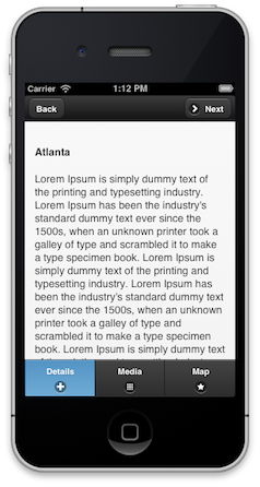
The End Result

Navigation Tabs

The Gist for this code is located here.

Creating a Jekyll Blog

Purpose

Today I went about creating a blog for the first time. I’ve never had any sort of blog in the past. I will be creating it from scratch, and hopefully will find some cool tricks along the way.

One of the purposes of this is to learn Jekyll as it’s one of the options for Github Pages. This page, will serve as a place that I can share interesting technical tips or tricks that I discover while working on various projects.

In addition to that, I will post tricks I find over the course of developing this site which I hope will help future users of Jekyll get started.

At this point, I have a basic working Jekyll blog. There is no pagination, no commenting, but the basics are there. Some of the things that I will be working towards implementing are:

  • Categories for posts
  • Commenting (probably through disqus, althouth this is lower priority)

The code for this blog is available at kwbock/kwbock.github.com